
Tool
Improving Mparivahan a little better

Mparivahan
Redesign 2.0
2024
Ajay landge
App
Cognitive
Explore app
Pain points
Improve
UI/UX
Polishing the Look, Keeping the Core
UI Design
Main problem
Mparivahan is a popular Indian technology application, widely used by both the youth and government sectors.
It serves as the largest platform for finding vehicle owner details and checking the validity of vehicles.
However, the overall user experience (UX) and user interface (UI) of Mparivahan currently fall short, which is concerning for an application of this scale.
Such a critical tool should not display poor performance indicators.
Solution
Driven by interest, I undertook this redesign to demonstrate my design perspective and introduce a more up-to-date solution.
mparivahan UI/UX performance
Logo branding
Performance Analysis
Home page
Nearby page
Help page
Profile page
Setting page
Complaint page
Poor
Mediocre
Acceptable
Decent
Good
After
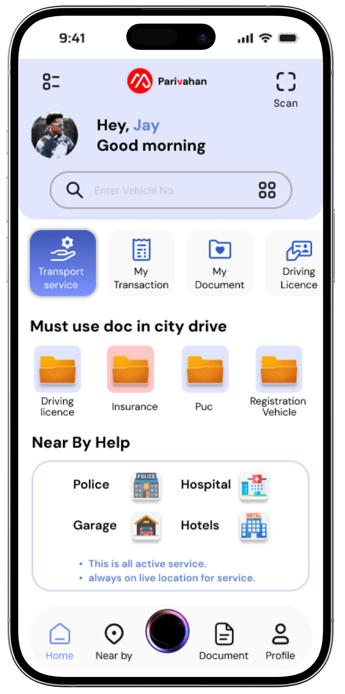
Top screen features
Scan feature: Easy document scanning, cutting down on time and effort, thanks to Hick’s Law.
Trustworthy profile: Clear profiles build user trust, applying Jakob’s Law for familiar layouts.
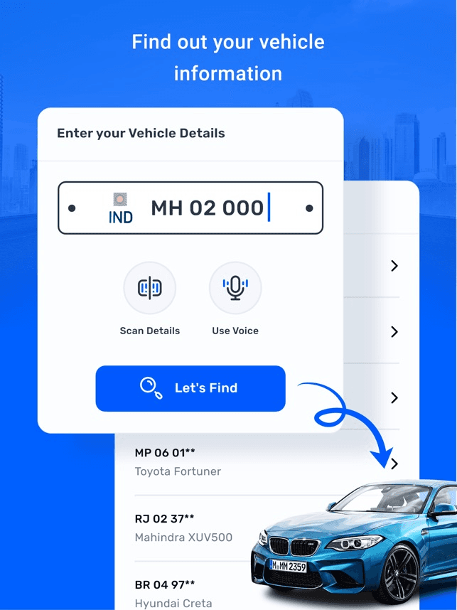
Visible search bar: Positioned for quick access, using Fitts’s Law to make it effortless.
Enhanced vehicle search popup: Added filters to keep it simple and user-friendly, based on Miller’s Law.
Mid screen features
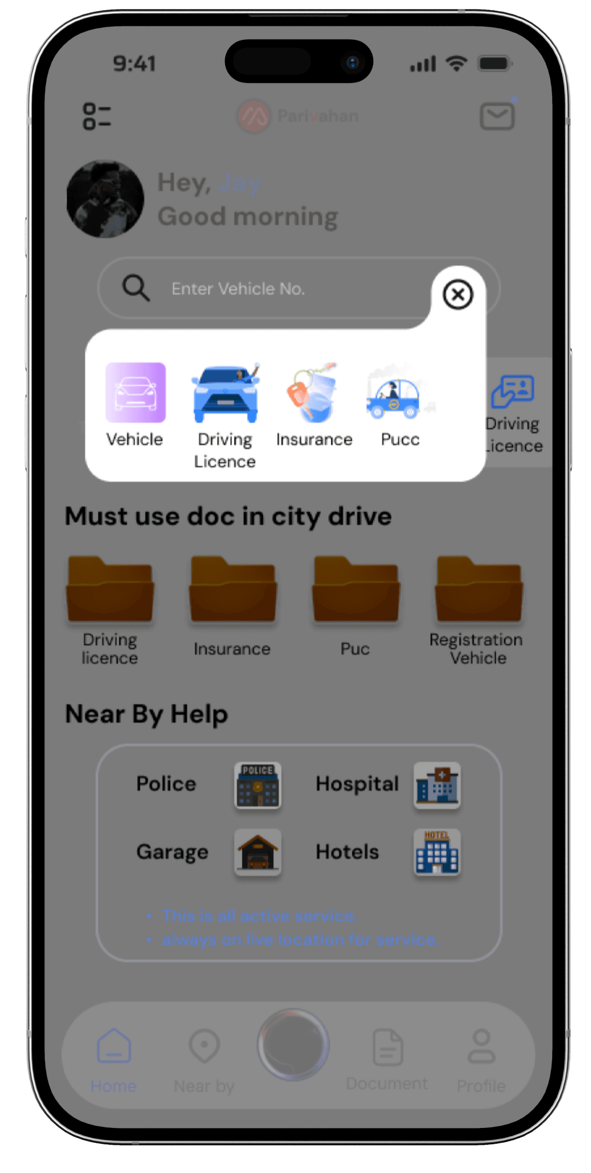
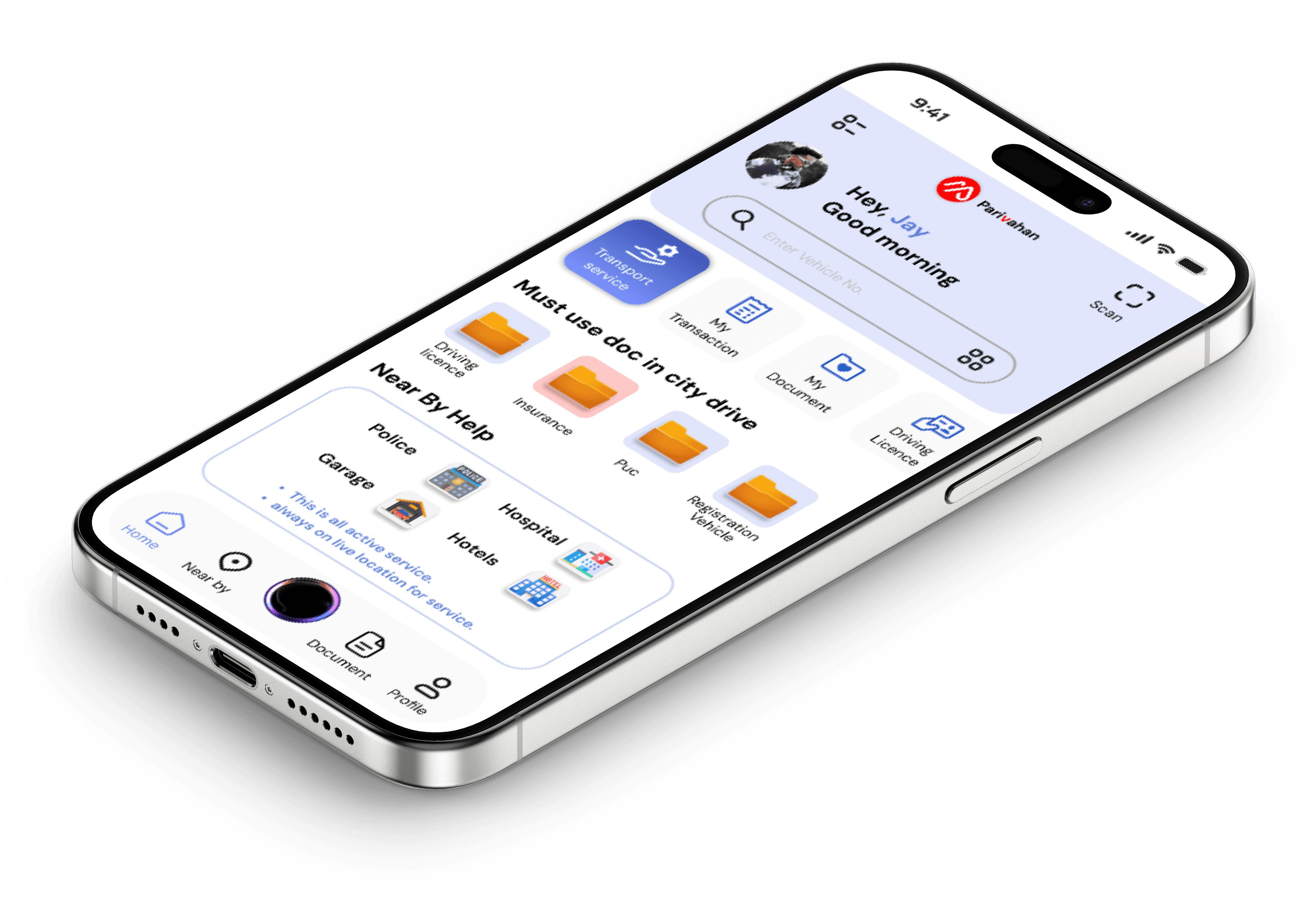
All important Document is also inbuild in home page.
Document shows which document is expired or soon.
Near service is visible and one click use.
Instructions available for use.
For understanding
More visible clean and typography also visible minimal services
for users can use it.
What about the main page of the app
After


As I mentioned before, documents are important for users. The app should indicate when their documents are set to expire.
Notification are visible all information and update in the notification.
Security features have been added, along with a search bar to search for documents, and a filter option.
The UI is clear and clean, with all icons and colours clearly visible and detailed.
There are no additional options available in the document section
As a user, it feels untrustworthy, and the design doesn't communicate anything effectively.
From personal use, I found a problem where clicking on the document does nothing.
Adding documents is very complicated and not user-friendly, as it requires entering numbers and other details every time.
Before

(2)
During sign-up, the user's name and headline are always displayed. A must-have option has been added to the screen for easier access.
The option helps users understand how to use the app and get answers, without requiring complex or professional language.
Based on research, the top four options have been added.
Home page
Profile page
Near by
Complaint
Ai screens
Prototype
Side menu
Document
This is very well feature & function
After
After
After
Before
Before
Before
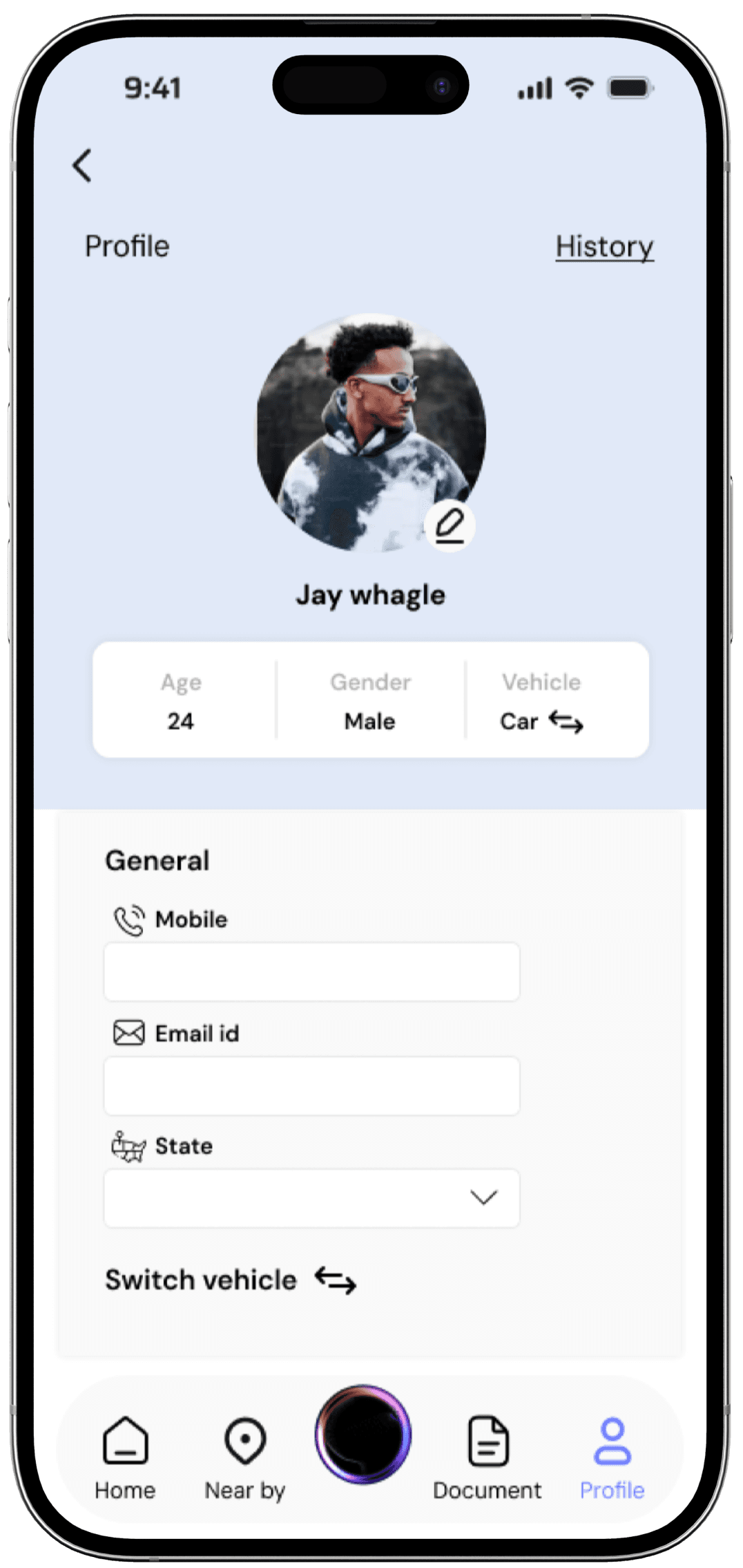
The profile picture and edit icon are easy to understand and use.
User details are visible only to the owner.
The vehicle switch is an important feature, allowing users to manage both vehicles efficiently.
Icons help users easily navigate and understand the information the app is providing.
The search queries and details added by the user at the top right are saved in the history.
Before
The Profile and User Welcome sections feel untrustworthy, with too much empty space, and the layout looks awkward.
I personally found the bottom bar navigation's settings icon to be unusable.
Traffic visibility is not recommended, as Google Maps already provides this feature.
Services available but no one can used as per data.

Profile Icon and other feature not added.
Edit profile user only edit name, email & state
what about phone number?
The title clearly reflects what the user wants.
A sidebar is also present on the screen..
The design below is similar to the old screen, but most of the features have been added.
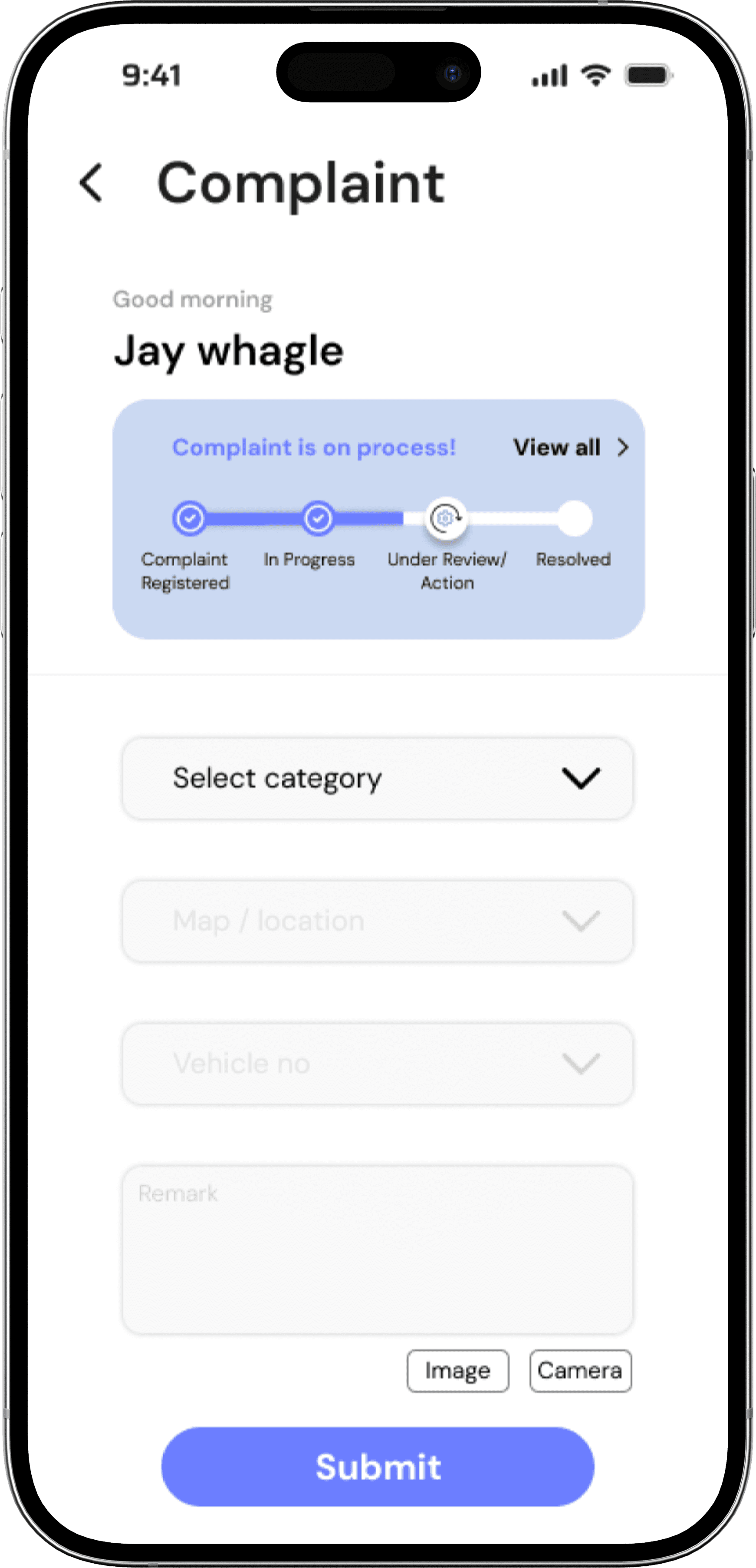
Mention the user's name and greet them with clear, friendly communication.
The main feature is a progress bar that helps users track the status of their complaint, such as In Progress, Under Review, etc.
For security reasons, I cannot capture the original screen to mention here.
At the bottom right, there are two options—image and camera—for easy navigation.
From personal use and exploration, I noticed that the complaint feature provides selected offers.
They do not provide a live photo option or features for reporting accidents and other related issues.
Most of the features have been changed compared to the old screen.
Call back feature or 24/7 helpline number
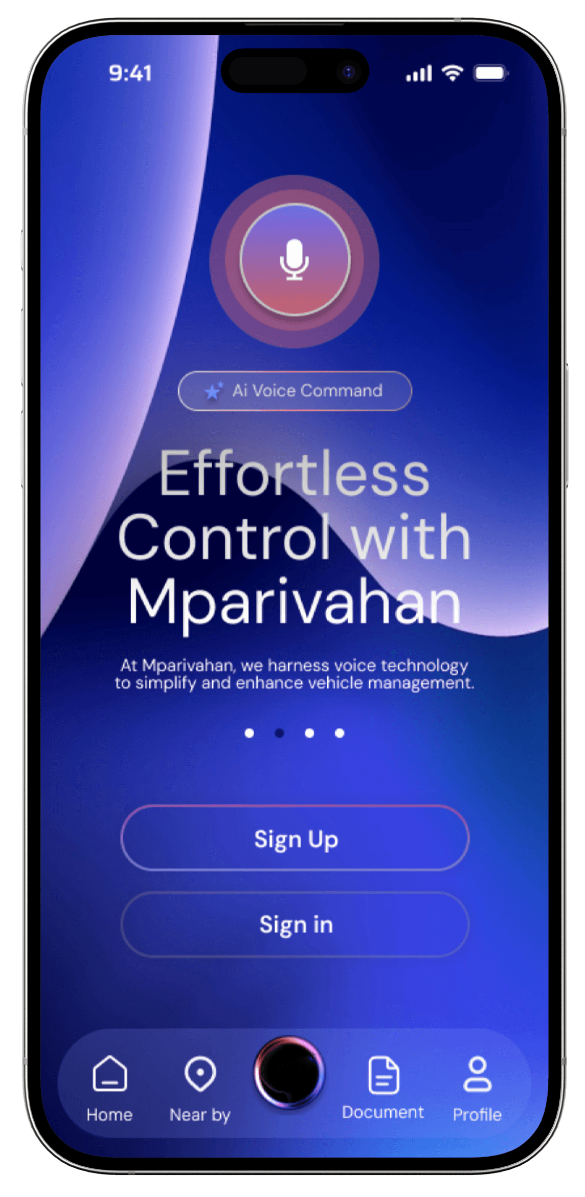
Based on research and analysis, the AI feature is very useful, providing users with all necessary details.
Voice commands and easy sign-up make the app user-friendly.
All useful commands and information are displayed on the screen, allowing users to better understand and navigate.
The voice command feature listens to everything in natural language and provides the answers you're looking for.
The icons and color visualization are well-designed.
As you can see, more useful features have been added to the new screen.
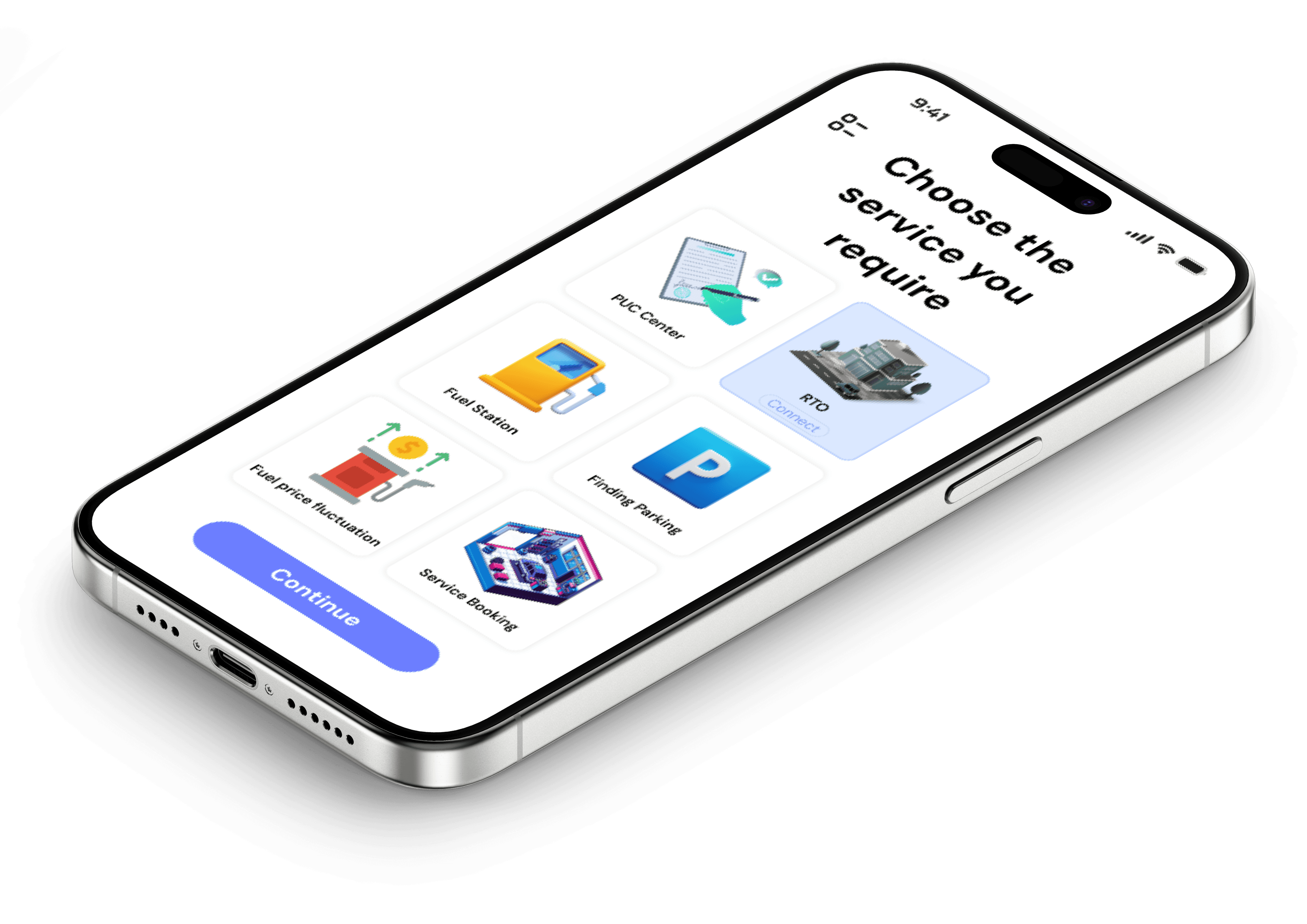
(Finding parking, service booking etc.)
Tap the continue button to open nearby services based on your preferences.
The services aren't bad, but based on research, they are not typically very useful.
Based on personal research, the view map feature does not effectively suggest nearby services.
In the new screen, the connect option provides accurate information for the user.
No more feature for user can easy to navigate and
history details not here.
No icons and design nothing speak anything.


(1)
(3)


Components
Home
Near by
Document

Profile
Home
Near by
Document

Profile
Icons


Refine user interface: Simplify and modernize the app’s design for smoother navigation.
Introduce new features: Add useful tools to enhance functionality and user convenience.
Boost engagement: Create a more intuitive experience to keep users active.
Improve retention: Make updates that encourage users to return and use the app regularly.
Seamless integration: Ensure new features fit naturally into the app’s existing structure.
Streamline navigation: Reduce friction in accessing key vehicle-related services.

Scroll down

Check it out new one
case study..
Some of my other stuff.